Out of all the design disciplines that Cross Design offers, be it logos, web design, or print collateral, it is package design that evokes the greatest emotion within the consumer experience. Putting forward your brand into a 3-dimensional form, you have now welcomed your consumer into the tactile transmission of your brand.
The design choices appointed to represent your product packaging can have a much greater and longer lasting impact than other aspects of your brand. Many times these products are visited on a daily basis; resulting in an ongoing exchange with your consumer, whether you realize it or not.
The choices you make should embody your company credo, your base philosophy. Small details and choices of materials can make a significant impact in perception and your company philosophy. Below is one example of a recently completed packing project at Cross Design, showing you just a slice of the creative process.
___
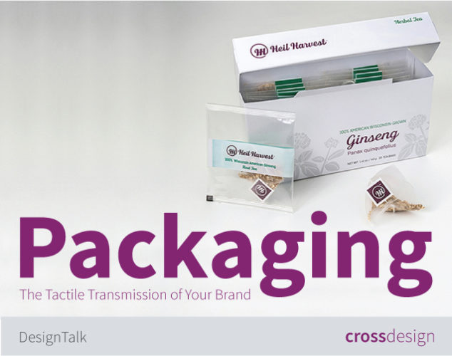
Case Study: Heil Harvest
At the Cross Design studio, we recently completed new packaging for a ginseng grower, now taking his product to the retail market. First and foremost, Cross Design developed a logo and the brand foundation elements for a new ginseng company, Heil Harvest. After clearly establishing a footing for the brand, we then moved on to the package design for four distinct retail products and their initial brand launch.
Step 1. An Evaluation of Product Categories
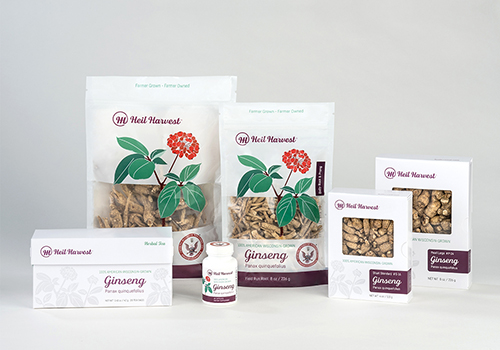
Heil Harvest launched the new company with four products, all with very distinct price-points. The brand representation for these different product categories needed to be given individual attention to assist in keeping them distinct with the specific end-user in mind.
As a result, two well-defined product category classifications were established to separate the different price points: Group 1: an everyday “regular-use” product category, and Group 2: a specialty “high-end”. The two products slated for Group 1 are the Ginseng Dietary Supplement Capsules and the Ginseng Field Roots. Group 2 is a Ginseng Tea and Premium Root Gift Boxes.
Cross Design needed to create a branding element that would link these two categories, but at the same time set-off their independence. The solution was to create a custom illustration of the ginseng plant for the brand, but implement this graphic brand icon differently for the separate group classifications.


Step 2. Creation and Implementation of the Brand Visuals into the Price-Point Categories
For the two “regular-use” everyday products, , the illustration is shown in full-color, always in the same fashion, becoming an icon of sorts. Still showing the grandness and elegance of the ginseng plant, because even though these are everyday items, by no means did we want to insinuate inferior quality. This packaging needed to reflect as an affordable, daily item that would not break-the budget.
The other two products, a Ginseng Tea, and the Premium Root Gift Boxes, needed to express the splendor of the exceptional quality of the high-end roots. So, for these two products the base illustration was used and modified to a very elegant blind emboss solution. The white blind emboss: showing the product purity, elegance, and exceptional product grade. Adding a bit of metallic to the brand elements on these products continued the price-point elevation.


Step 3: Functional Packaging and Material Costs
No matter what design, color, illustration, typographic solutions, etc . that are created for the packaging, a top priority must be practical solutions for how the 3-dimensional packaging will function.
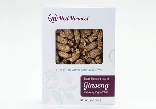
An example for developing practice solutions with this particular project was the distinctive criteria for the Premium Root Gift Boxes.
This packaging required a custom-made box with a window to showcase the premium roots without the consumer having to open the package, as well as the need to function as a re-usable/closable package. In addition to the functionality, the Premium Root Boxes had two different sizes, a 4oz and an 8oz size, with sweeping number of different product variations to accommodate. Cross Design needed to create an economical solution for all of these variations without the need to print individual boxes for each variety.
The solution was a custom drawer-style box with a window to allow for customer inspection of the roots. Both the 4oz and 8oz were initially printed with the common design elements as well as the Nutritional Facts panels. Then, individual product labels were designed to assist in both the package seal as well as distinguish the nine independent product varieties, and we did this by printing only one size label that would fit both the 4oz and the 8oz box. By only needing to print label seal stickers to differentiate the product varieties, and not effect the actual box package, a tremendous amount of costs were saved in printing and production.
___
This packaging project example above only covers a small snippet of the thoughts and actions that go into the process of package creation. Items not spoken of: competitor analysis, typography and copy/text language chosen, development of Nutritional Facts and Supplement Facts panels, bar code needs, just to name a few. Cross Design can help you through the packaging process from concept, to design, through final production to enhance your brand with consumer-friendly packaging.